If you want to create a web page, there are certain design features it must have. These features will ensure that the visitors have a pleasant user experience. This article will reveal what these features are to enable you to increase leads and search engine visibility.
Hamburger Menu
A lot of the people who visit your site may be using smartphones. You can visit https://explodingtopics.com/ to see some interesting smartphone internet usage statistics. It should be easy to use your website on both computers and phones. A common part of mobile-friendly website design is hamburger menus.
There is a limited amount of room on websites, especially on smaller screens. The hamburger menu can help save some of that space. A hamburger menu is usually in the corner of your website or app.
It looks like three lines or dots stacked on top of each other. Anyone can figure out this way to hide your settings or expanded menu. Most people know this is where to click to see the whole menu bar.
Floating Navigation
Adding a floating control menu bar, also called a “sticky menu,” will keep people from getting lost. These menu bars stay put at the top of the page. If a person moves down, the menu stays at the top of the screen. They never have to scroll back up to get back to the home page or click on a different menu item.
Negative Space and Background
You can use whitespace to add focus points and control where the user’s eyes naturally go on the page. This creative web page design is also known as negative space. This method is common in minimalist designs and can help a website look modern and keep it from having too much information.
Adding whitespace between pieces of information can help make them easier to find. Most of the time, the more space there is between two parts, the less connected they are. Use whitespace to your advantage to draw attention to your call-to-action button or lead creation form.

There are times when white space doesn’t need to be white. Any background or color block can be used. Negative space helps people understand what’s on the page and shows them what the main points are. When used right, it’s a great tool that can help you build your business.
Consistent Colors and Appropriate Images
Branding is an important thing to think about for your website. Everything on your website, from the tone of the text to the colors of the images, should match your brand. It should be the same for customers who see your goods in person, on social media, and on your website.
Set up a visual brand style guide and make sure that all of your new pages and material follow it. It should include a set of colors, typography, imagery, and logo guidelines. This will ensure consistency across your web pages.
The pictures you put on your website should look like the pictures on the boxes of your products and on social media. Make sure that every picture you use fits with your goods and services. Don’t use stock photos.
Unique Typography
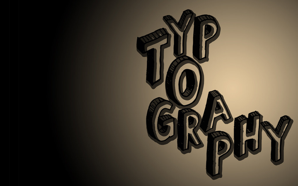
Typography is the way that your website’s text looks. Typography is made up of things like font, space, style, and size. The fonts and typefaces you use are an important part of your business. Typography also has a big impact on how easy something is to read and how the user feels generally.
When fonts are the wrong size or shape, they can make a website hard to read and browse on phones. When you pick a font and start writing on your website, you should plan ahead. Ensure that the visual and functional experience are as good as possible for the user.
· Stick to common fonts. With sans-serif fonts like Ariel and Tahoma, it’s easier to read text at a range of sizes and on most devices.
· Set a minimum size for the font. Set your website’s minimum font size to 16px to avoid having text that is too small to read.
· Pay attention to how long each line is. Text lines should be between 45 and 75 characters long. This will keep readers from getting tired and make the text easier to read.
· Make sentences shorter. Keep it short. Write short, clear words instead of ones that go on and on.
· Leave some space between words. It will be easier to read if you put space between paragraphs and words. As a general rule, keep the space between words 1.5 times the size of the font.

· Use bullet points. You can read this article to find out when to use bullet points. Bullet points will make your text easier to read.
Before you add text to your website, make sure you set up the right text order. This will help people read it, and Google will find it more quickly. It’s hard to read long blocks of words. Using headings makes them easier to understand and better organized.
· H1: The heading
· Heading 2: The main points
· H3–H6: Subheadings to give the text structure
Dark Mode
A popular website feature that’s here to stay is a dark mode UI (user interface). Users can choose a darker color scheme through “dark mode” on websites and mobile apps. With this mode, text is not always black on white backgrounds. A lot of people think that websites look better and more updated when they are in dark mode.
Some good things about dark mode are:
· Gives off less blue light. Blue light can make people stay awake at night and make it hard to sleep.
· Makes eyes less tired. Most of the time, darker web pages are easier on the eyes.
· More interesting. Pops of color can be used to draw attention in a smart way.
· Less use of electricity. Less lighting is needed for darker screens, which saves energy at home and makes the battery last longer.
Conclusion
Your website pages are integral to the success of your business. Therefore, you need to make it as user-friendly as possible. In this article, we’ve discussed some features that your web pages must have.
